House
Austin TX
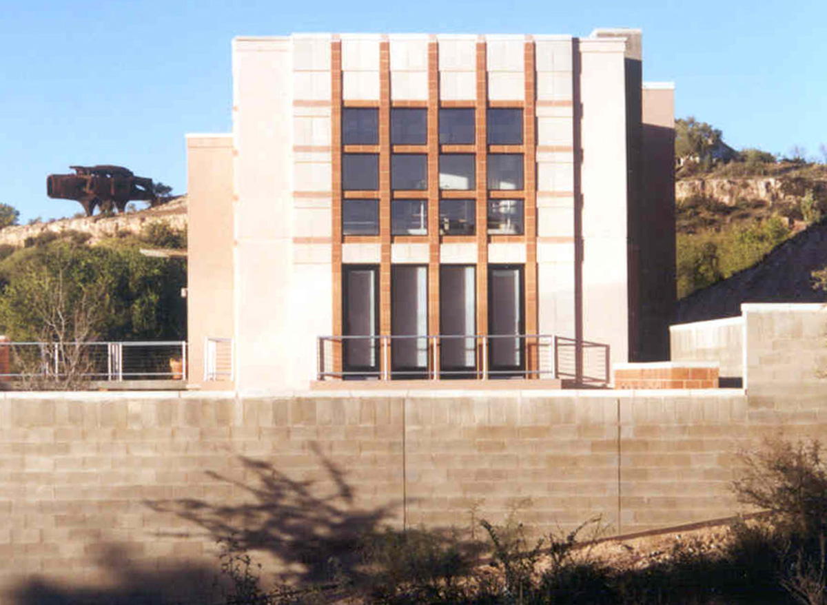
The interior volumes are organized along a long gallery hall that extends from the main entry all the way to the back entry and the detached garage beyond. The rammed earth studio space is a distinct element slightly shifted in angle from the main volume. The studio is a rectangle that has been split with a butt glazed window illustrating the subtle, shifting geometry. The interior of the studio is loft-like with exposed wood/steel joists and deep Douglas fir support beam.
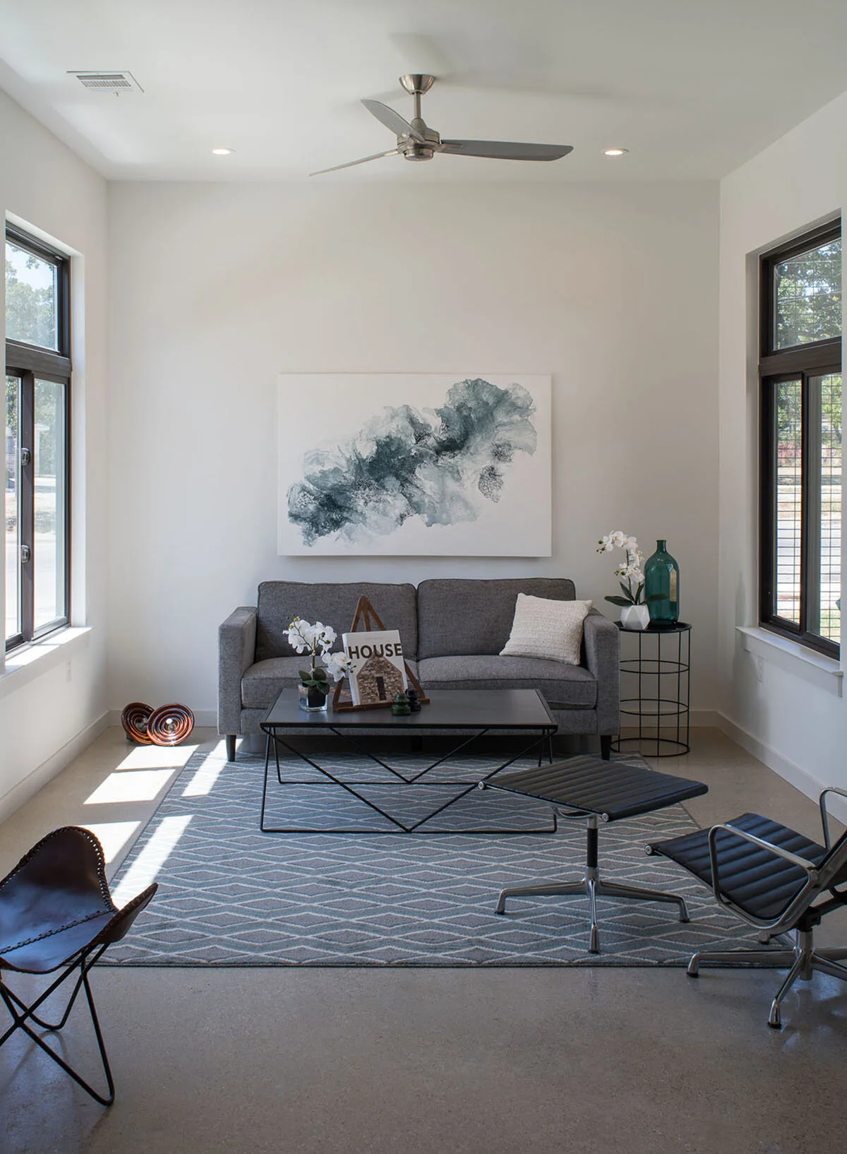
The Living Room is a vaulted space expressing the classic house shape seen at the front facade with exposed steel columns/rafters with rhythmic wood beams in between. The main wall of the living area is a brushed stone with dramatic steel shelving and lighting washing the wall texture punctuated with three glass brick apertures.
The kitchen and glass cube breakfast room are connected to the main living area with the corner, butt glazed seating area creating a space that feels projected into the landscape.
Two small pocket courtyards inspired by the Kimbell Museum are inter-weaved along the spine and create shafts of exterior space that interlock with the interior volume and exterior materials extend inside to enhance the connection.
The Dining Room and Sitting Room are cubic pavilions with red roman brick enclosures with walls that also extend inside to complete the expression of the pure geometry of the volumes.
The two middle bedrooms and guest bath occupy the middle pod each with angled window seats. The guest bath also has a window up high allowing borrowed light to filter in so that every major interior space has ample natural light. The master bedroom/bathroom pod ends the linear expression of the gable shape and extends to the connected covered porch. The master bedroom has an asymmetric, subtly curved ceiling lit by hidden lighting to create an elegant expressive space.
The linear expression and other key design elements are accentuated with striking lighting elements that allow a layered effect offering a wide array of atmospheres as well as illuminating the integrated art collection. A skylight/lightwell at the hallway near the Sitting Room allows views to the leafy branches above and at night are punctuated with a color changing LED fixture providing a punch of color, changeable at will.
Material delineation reinforces the volume separation and enhance the spatial perception. For example, the polished concrete floor accentuates the long gallery hall with a slight change to burnished concrete at volumes where the pavilions intersect with the hallway. Raised or lowered wood flooring delineate certain spaces offering distinction from the circulation areas.
Throughout is a sophisticated mix of materials from unique ceramic tile and stone tile as well as recycled pressed paper used for baseboards and built-in desks and shelving. The used form boards from the rammed earth process were utilized as a silding barn door and wall accents to display the interesting process of construction but also use site generated reclaimed materials.
The extensive glazing throughout provides ever changing vistas and effects with both the shadows of tree limbs creating a floor and wall painting of shadows that is also evident with moonlight.
The linear configuration was dictated by the protection and integration of multiple mature trees and the result is a set of volumes that connect to the site and allow the house to feel nestled into a park as if built years ago.
Construction Drawing Production
A5 Design
(Alex Whitaker)
Structural Engineer:
Feldt Consulting Engineers
(Ben Feldt)
Lighting Design Consultant:
Essential Light Design Studio
(Jill Klores)
Millwork:
henrybuilt
Photographs by Paul Bardagjy


